Overview
Widget is the most basic elements that make up the page, you can use the Widget browser to add the Widget to the page, and page free to drag and drop Widget placement. Widget can be games, mini applications, news feeds, flash links, image links, order form, html text or any content. When added to web page it will become a part of the page, it can be moved, closed, imported, exported, customized style by authorized users.
Widgets in combination with dynamic pages greatly simplify development of Web pages, write page code replaced by drag-and-drop widgets, users no need to touch any code to create feature - rich pages.
Introduction to widgets
Widget can be used as a separate module to develop, install, pack and share. You can create widgets with DotNetAge widget editor or download the widget packages from DotNetAge widget gallery . Widgets are very easy to create and DotNetAge offers many ways to create widgets for different skill level users. Even you are only know html you can still create widgets.
For more information about create widgets please refer to : Creating and managing widgets
The widgets could be placed in any page that has widget zones, users can export the widget user preferences and share with other users or import to other webpages.
Widget is the smallest functional unit of the DotNetAge web sites. Widgets has same behaviors, properties and appearance the only different is their content and functionality.
Behaviors
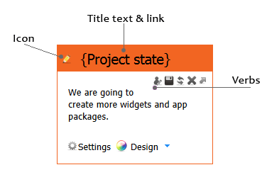
On the upper right corner of the Widget header there are a set of verb buttons. You can export widget user preferences,refresh, delete, toggle and open user preferences settings.
- Export – Export current widget settings including title,title link,icon, styles and user preferences to widget data file (*.dat). You could import the data file to create a new widget copy on other page(s) or other site(s).
- Refresh – Refresh the widget output.
- Delete – Delete the widget from current page.
- Toggle - Expand or collapse the widget. You can collapse the widget to hide in read only mode.
- Show user preferences
Properties
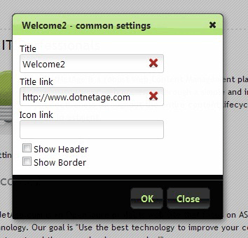
- Title - The widget header title text.
- Title link - The link url of the title text.
- Icon link - The icon url that displayed on the left of the title text.
- Show header - Show/Hide the widget header.
- Show border - Show/Hide the widget border style.
Appearance
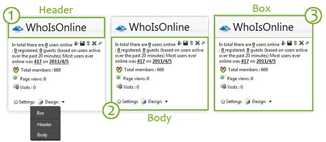
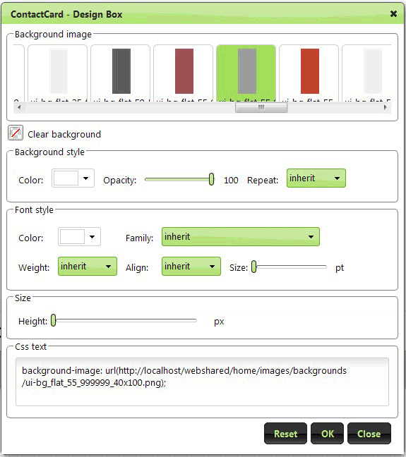
Widgets could be customized the style by UIDesigner, There are three parts we could be design in widget:Header,Body and Box.
Widget UIDesigner:
Adding widgets to webpage
View modes
The web pages has two view modes: Read only mode and Design mode.If you are an administrator, web owner or have “Design page” permission you can change the page view mode in “SiteTool->Design this page” menu.
Read only mode is render a public page view and could not be changed any content on the page.
Design mode allows you could add, delete, expand, close, import, drag and drop then widgets on the page. And also could be set the user preferences, common settings of widget and designing the styles of the widgets.
Widget explorer
The Widget explorer is the box that list all available widgets you could add to your page. You can use the WidgetExplorer to view widgets info, add new widget, import widgets from data files and preview the widgets.
In page Design mode click “SiteTools->Add content” to popup the Widget Explorer.
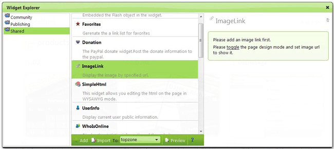
On the left of the Widget Explorer are widget categories, in the middle are widgets under the selected category. You can select a widget in list and choice a widget zone where the should be added then click the “Add” button to add a new widget on current page.
- Add - Add the selected widget to the selected widget zone.
- Import - Upload and import a widget data file (*.dat) and create a new widget to selected widget zone.
- Preview - Preview the selected widget.
-
Average:
-
Читает(1356)
-
Trackback(0)
-
Постоянная ссылка


Комментарии (0)